Sharing the Knowledge
Some industries have products that can be hard for their target audience to understand. That was the case for the web design for our client, a financial services company in Tampa, FL.
The Challenge
Our client needed a new website, and it had to check off all the boxes:
- Simple to use and navigate
- Mobile friendly
- Attractive
- Conversion-focused
- Easy to understand
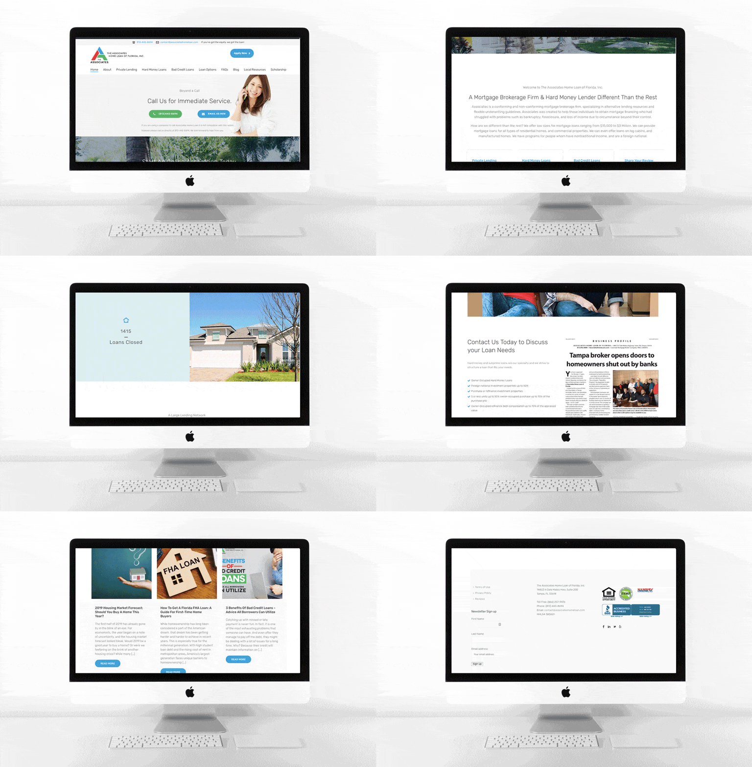
We knew we had our work cut out for us, but our web developers got to work creating a gorgeous site that featured clear navigation. Their goal was to make all the information on the client’s site easy to find. First, they created a header with the company’s contact info and a clear CTA, “Apply Now.”
Next, they highlighted their most popular products and pages on a banner that remains on the top of site when you scroll down or switch to another page. This site-hierarchy isn’t just popular with website visitors, though. In addition to reducing bounce rates, it also makes it easier for Google and other search engines to index the site.
While creating these elements, our developers also kept thinking about how this would look on different devices. The end result is a website that looks great regardless of whether you’re on a tablet, a phone, or a laptop.

Custom Content
Lastly, our writers got to work creating content that was accessible for all audiences. Sure, they used financial terms, but they made sure to explain everything plainly and to always be clear. Now, our client’s site is more than just about getting conversion. It’s also an educational tool and an important part of their sales funnel.


