Our Client
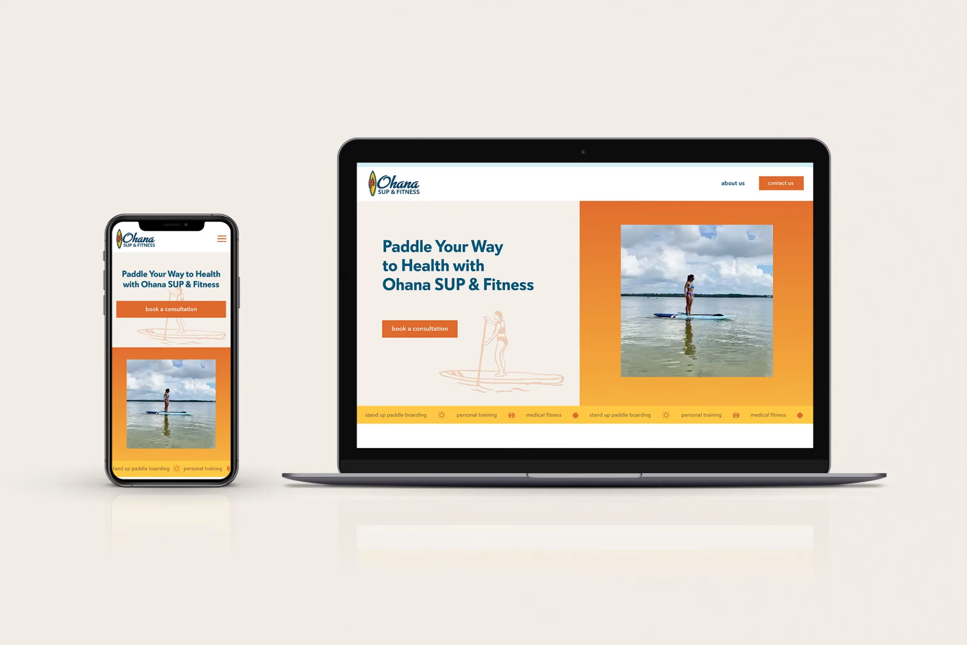
Ohana SUP & Fitness is a brand new Tampa Bay, FL-based private training, online coaching, and standup paddleboarding (SUP) business. They help people cultivate a healthy lifestyle in a non-intimidating, positive environment that connects people with nature and the community.
Challenge
As a brand-new company, Ohana SUP & Fitness did not have any existing brand guidelines or copy to use for the website. We needed to concept, develop, and deploy the project from scratch – and drive reach to the right target audience.
Objectives
Ohana SUP & Fitness came to us looking for a way to put their best foot forward online and generate leads for their business.
In addition to technical elements, this meant shaping their integrated brand messaging to encompass medical, recreational, and personal fitness. They were looking for a professional website and branding to reflect their complete service menu while also capturing their values of family and personal well-being.
Strategy
To create a strategy that reflected well on our client, we dove headfirst into industry research. We then developed a local search ad strategy based on the client’s specific niche, budget, and marketing goals.
We also took the time to sit down with the client to extract key elements of their branding and hone in on their intended customers. This was essential for bringing the spirit and tone of the website copy to life in a way that felt relatable to their audience. The client had put some careful thought into what that looked like but needed us to translate the vision into tangible deliverables.
A Custom Website Style Guide
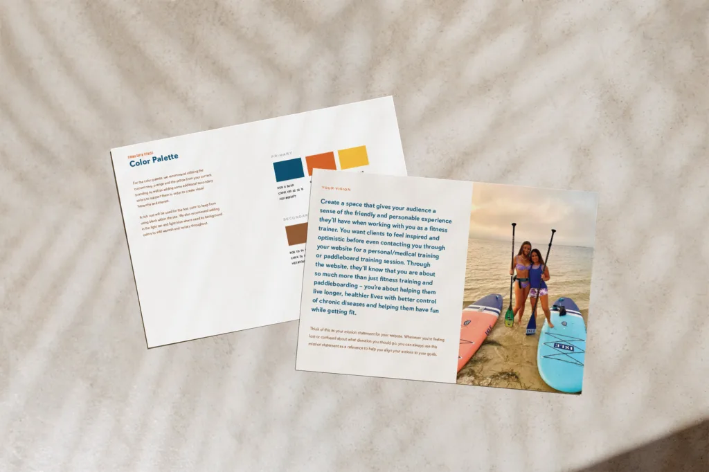
The website copy and graphic design were crafted around the client’s specific tone of voice with inspiration drawn from SUP culture, client interviews, and healthy living. Because of the nature of personal training, special emphasis was spent on personalizing the website copy with a focus on the trainers themselves, so potential customers could get to know the clients and feel an initial connection. Additionally, appropriate searchable keywords were married with the copy intent.
A new brand identity with custom illustrations

A color palette infused with their logo spirit and clean lines shaped their aesthetics. Custom illustrations helped create distinctive brand markers to single the company out as memorable from the rest of the competitive market in their area.
Customer attraction strategy
To drive traffic to the website, we decided to focus on the bottom-of-the-funnel users by targeting relevant keywords with high commercial intent to maximize leads within the budget.
We established an ad account, implemented conversion tracking, and then launched the ad campaigns. Since the client’s website was not optimized for online lead generation, to achieve optimal results, we worked with them to develop the conversion funnel and build a dedicated landing page for the PPC ads. Our KPIs for the paid media included phone calls, online form submissions, cost per lead, etc.
Results
A brand new website to generate leads
The client was thrilled with the exemplary attention to detail by the Digital Neighbor team during the creation process of the company’s first fitness business website, leaving an outstanding public review.


